Title here
Summary here
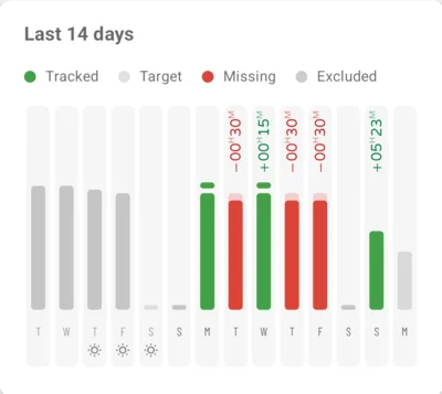
Last 14 days chart, redesigned
Each day now shows its target as a faint bar behind the time you tracked. Days that reached their target are green, with the extra time written above the bar. Days that fell short are red, with the missing time. Vacation, holidays and sick days get a small icon below the weekday, and days before your time balance starts are grey. Tap a day for its details.